MeridianConnect — Enterprise SaaS UX Design
About the Project
MeridianConnect is a cloud-based SaaS dealer portal serving a national network of automotive dealerships across sales, finance, and service operations. The platform had grown organically over several years without a unified design system or UX strategy behind it. The result was a fragmented interface: inconsistent UI components across multiple product modules, no shared design language between teams, accessibility gaps that put the platform out of WCAG compliance, and a design-to-development handoff process that relied on outdated documentation and verbal communication.
Dealer staff, the primary users across sales, service, and finance roles, reported high task friction, frequent errors, and poor learnability when new features were released. The business impact was measurable. Onboarding new dealerships took significantly longer than projected, and support ticket volume for UI-related issues was trending upward quarter over quarter.
As the UX Designer embedded in the cross-functional product team, I led the end-to-end redesign of the platform's UI system, from initial audit and user research through component library delivery, responsive layout design, and developer handoff.
What I Did
The project began with a thorough audit of the existing interface. I conducted a heuristic evaluation using Nielsen's 10 usability heuristics across all major platform modules, documenting violations across consistency, error prevention, visibility of system status, and accessibility. In parallel I mapped every UI component in use across the product and catalogued the inconsistencies, finding multiple variations of the same button, input, and card styles being used interchangeably across modules with no governing rules.
To ground the design work in real user needs I developed three personas representing the primary user types on the platform. Marcus, a dealership sales manager, used the portal daily for inventory tracking and reporting and needed fast access to key metrics without navigating through multiple modules. Priya, a finance and insurance specialist, processed compliance-sensitive documentation and was experiencing accessibility barriers including poor contrast ratios and a lack of keyboard navigation support. Derek, a dealership IT administrator, managed user permissions and escalated interface issues, and was frustrated by ambiguous error states and no contextual help within the product.
Using these personas I mapped user journey flows for the three primary task paths, identifying the highest-friction points in each workflow. A set of How Might We statements translated the research findings into design opportunities, which I then prioritized based on user impact and engineering feasibility in collaboration with the product manager.
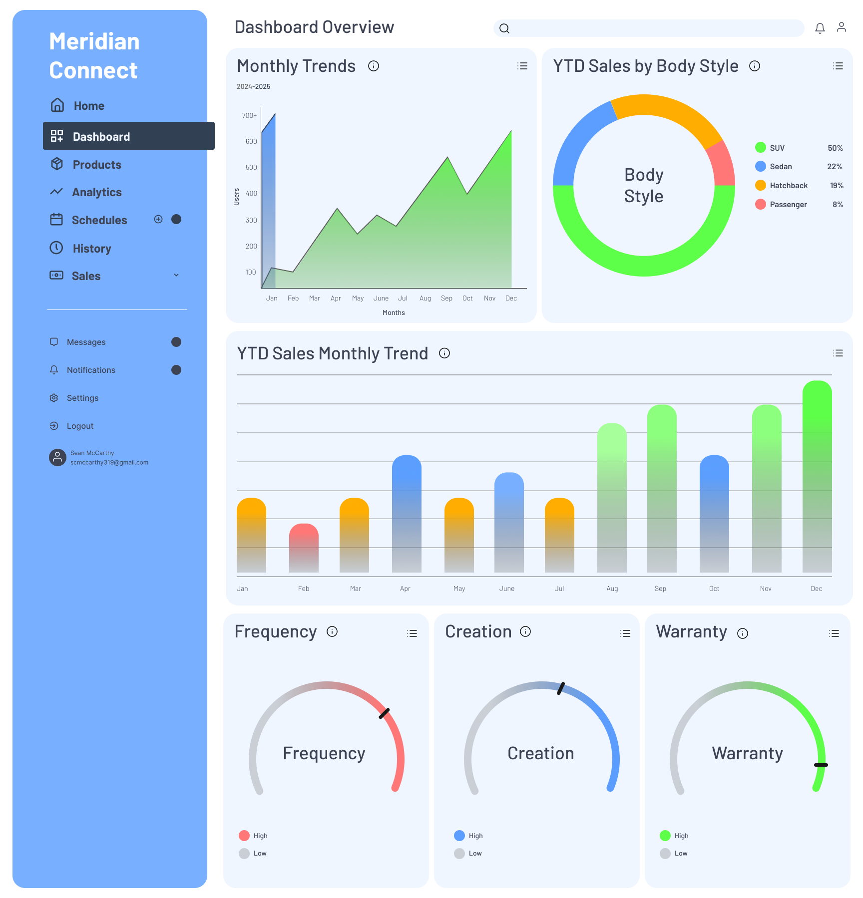
The design phase began with low-fidelity wireframes of the core dashboard layout, establishing a clear information hierarchy, navigation structure, and content prioritization before any visual decisions were made. Once the structural approach was validated I moved into building the full design system in Figma. The component library covers the complete UI toolkit: primary and secondary buttons with all interaction states, form inputs and validation patterns, data tables with sorting and filtering controls, navigation components, modals and drawers, notification and alert patterns, empty states, and loading indicators. Each component was built with variants covering default, hover, active, disabled, error, and focus states. Design tokens were defined for color, typography, spacing, border radius, and elevation, creating a single source of truth that could be referenced directly by engineers during development.
Accessibility was treated as a design constraint from the start rather than a compliance check at the end. Every color combination in the system was tested against WCAG 2.1 AA contrast requirements. Focus states were designed to be clearly visible for keyboard navigation. Interactive elements meet minimum touch target sizing for mobile contexts. All component annotations include accessibility notes for development handoff.
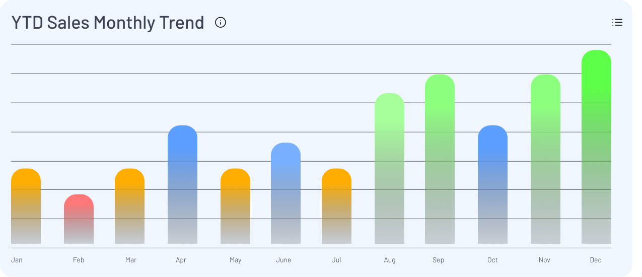
The redesigned dashboard consolidates the key metrics dealers need into a single scannable view, reducing the number of navigation steps required to reach critical information. Before and after comparisons of the core screens demonstrate the improvement in visual clarity, hierarchy, and consistency across the interface.
Final deliverables included the complete Figma component library with documented usage guidelines, annotated responsive layout specifications for desktop, tablet, and mobile breakpoints, and a structured developer handoff with redlines and interaction notes for each component. The design system reduced design-to-development cycle times by 40% by eliminating the back-and-forth that comes from inconsistent or undocumented design decisions.
Disclaimer
"This case study is a speculative project created to demonstrate UX process, systems thinking, and design methodology. MeridianConnect and Meridian Auto Group are fictional. This work does not represent any proprietary client interface or organization."
See my work
A selection of UX, brand, and design systems projects spanning enterprise SaaS, identity design, and research.