SquareWaves Brand Identity System
.png)
About the Project
When I joined SquareWaves as Lead Visual Designer, the company had an existing logo and visual identity but no unified system behind it. Different materials used different colors, fonts, and layouts, which made the brand feel inconsistent and less established than the quality of the work it represented. For a company selling design and digital services to clients, this was a credibility gap. The brand was not reflecting the level of professionalism the work deserved.
The goal was not to reinvent SquareWaves from scratch. The objective was to refine and strengthen what existed, build a complete system around it, and give the company a visual language that could grow with the business. I led the project from initial discovery through final delivery, making decisions about both the visual direction and the practical infrastructure behind the brand.
What I Did
I began with a discovery phase to understand how the brand was currently being used and how the company wanted to be perceived. I reviewed all existing materials including the logo, website, presentations, and social graphics to map where the inconsistencies were most visible. I then conducted a competitor analysis of similar digital agencies to understand how credible brands in the space were positioning themselves visually. Three qualities emerged consistently across the strongest examples: restraint, structure, and scalability.
From that research I built mood boards exploring two distinct visual directions. The first leaned minimal and technical. The second was bold and graphic with strong typographic presence. Presenting two defined directions with clear rationale gave leadership a meaningful choice rather than a single concept to react to. The bold and structured direction was selected, aligning with the company's goal of feeling more established and design-driven. A key part of that exploration was testing the brand name across a wide range of typefaces to find one that held authority at every scale.
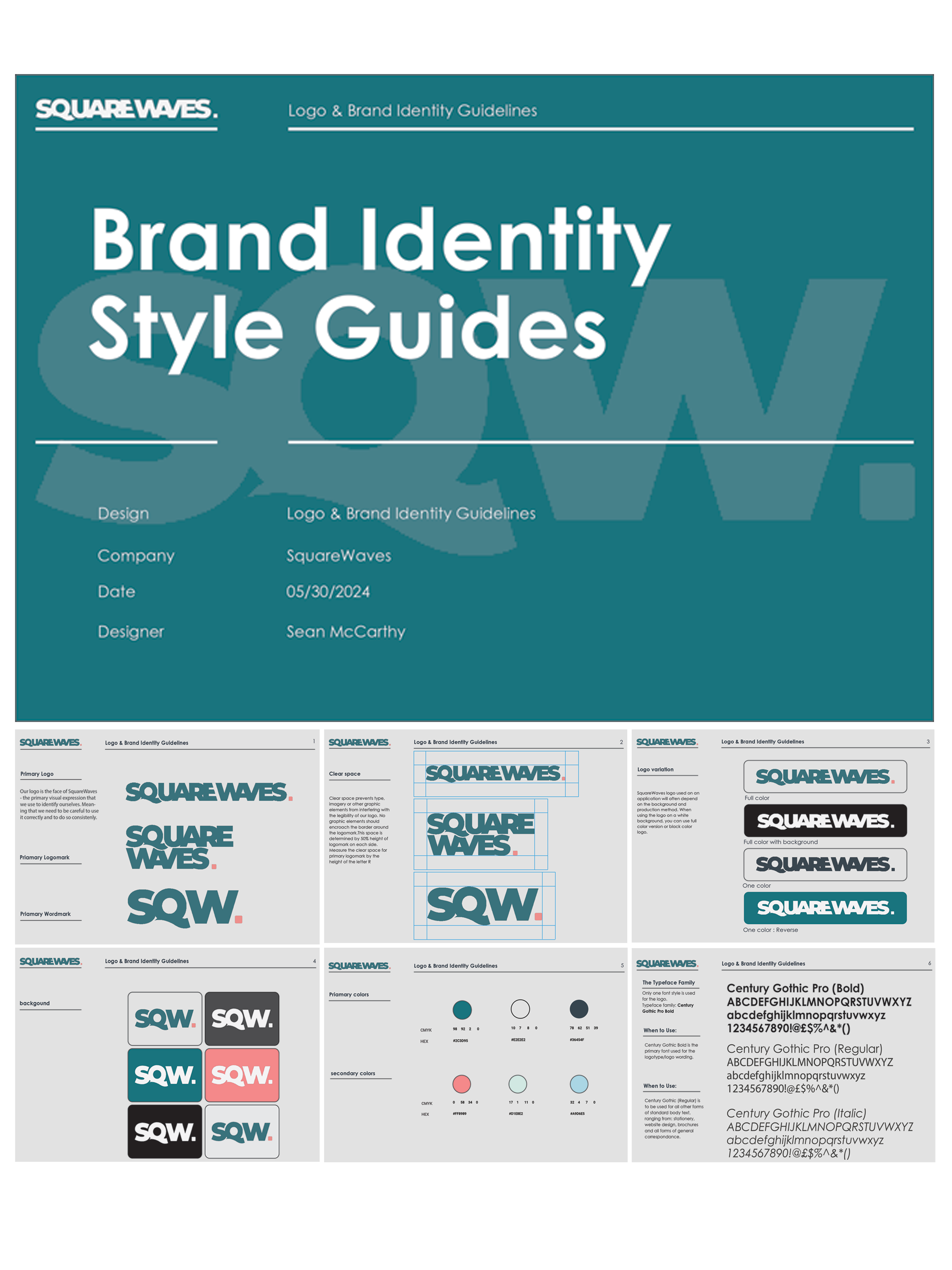
The final identity is built around three principles. Confidence through weight: the typography uses Century Gothic Pro Bold, a strong condensed sans-serif that reads with authority at any scale. Precision through color: the palette pairs a deep slate navy with a vibrant teal primary, supported by a warm coral accent and a range of neutrals that give the system flexibility without losing cohesion. Adaptability through a tiered logo system: three lockups were designed to serve different contexts while maintaining visual consistency across all applications.
Once the direction was approved I built the complete brand system documentation. The color system defines six values across primary, secondary, and neutral ranges, each with defined usage rules and WCAG-checked contrast ratios for digital accessibility. The typography system covers four hierarchy levels across display, heading, body, and caption, with defined size, weight, line height, and spacing values for both digital and print. Logo guidelines cover minimum size, clear space, approved color variations, and prohibited uses.

With the system documented I produced a full suite of branded collateral: business cards, presentation templates, social media graphic templates, website UI assets, and pitch deck layouts. Each application was designed to show how the brand scaled from small-format print to large digital screens without losing its visual character. The deliverable was not just a logo. It was a complete toolkit the team could use independently to produce brand-consistent work going forward.
The new identity was adopted across all client-facing platforms, internal presentations, and marketing materials. The brand guidelines became the standard reference for new creative work at SquareWaves, reducing recurring design decisions and ensuring consistency across every touchpoint. For a company whose product is design itself, a more cohesive and professional identity directly supported how they built trust with new clients.
Client Testimonial
"Sean has a strong grasp of design fundamentals, the technical expertise to work across all major design software, and a genuine passion for creativity that shows in his work. He approaches every project with thoughtfulness and professionalism, consistently delivering work that is both strategic and visually compelling. He is proactive, collaborative, and always willing to go the extra mile to ensure the final result exceeds expectations. Anyone would be lucky to have him on their team."
Ray Coklan, Co-Founder, SquareWaves
See my work
A selection of UX, brand, and design systems projects spanning enterprise SaaS, identity design, and research.